
Choosing the best font for email isn’t just a matter of visual style—it can directly influence whether your message is read, understood, or ignored. Fonts affect readability, perception, and even brand trust. As inboxes become more crowded and user attention more limited, using the right font becomes critical in email marketing and business communication.
Whether you’re a Business Development Representative (BDR), an Account Executive (AE), or a digital marketer, this guide will help you understand which fonts are best for email, why they work, and how to apply them effectively.
1. Why Do Fonts Matter?
Fonts go far beyond aesthetics. They directly impact how quickly and easily your email is understood.
- Readability: Users typically spend 10–12 seconds scanning emails. A cluttered or stylized font can hinder comprehension.
- Professionalism: Fonts influence perception. A clear, consistent font communicates credibility and attention to detail.
- Brand Consistency: Using the same font across your emails, website, and digital assets reinforces brand identity.
- Conversion Influence: Fonts can guide the reader’s eye to key elements like CTAs, making it easier to take action.
- Mobile Optimization: With most emails read on mobile devices, font legibility at small sizes is essential.
2. Categories of Email Font
Understanding font categories helps narrow your choices. The four major categories used in emails are:
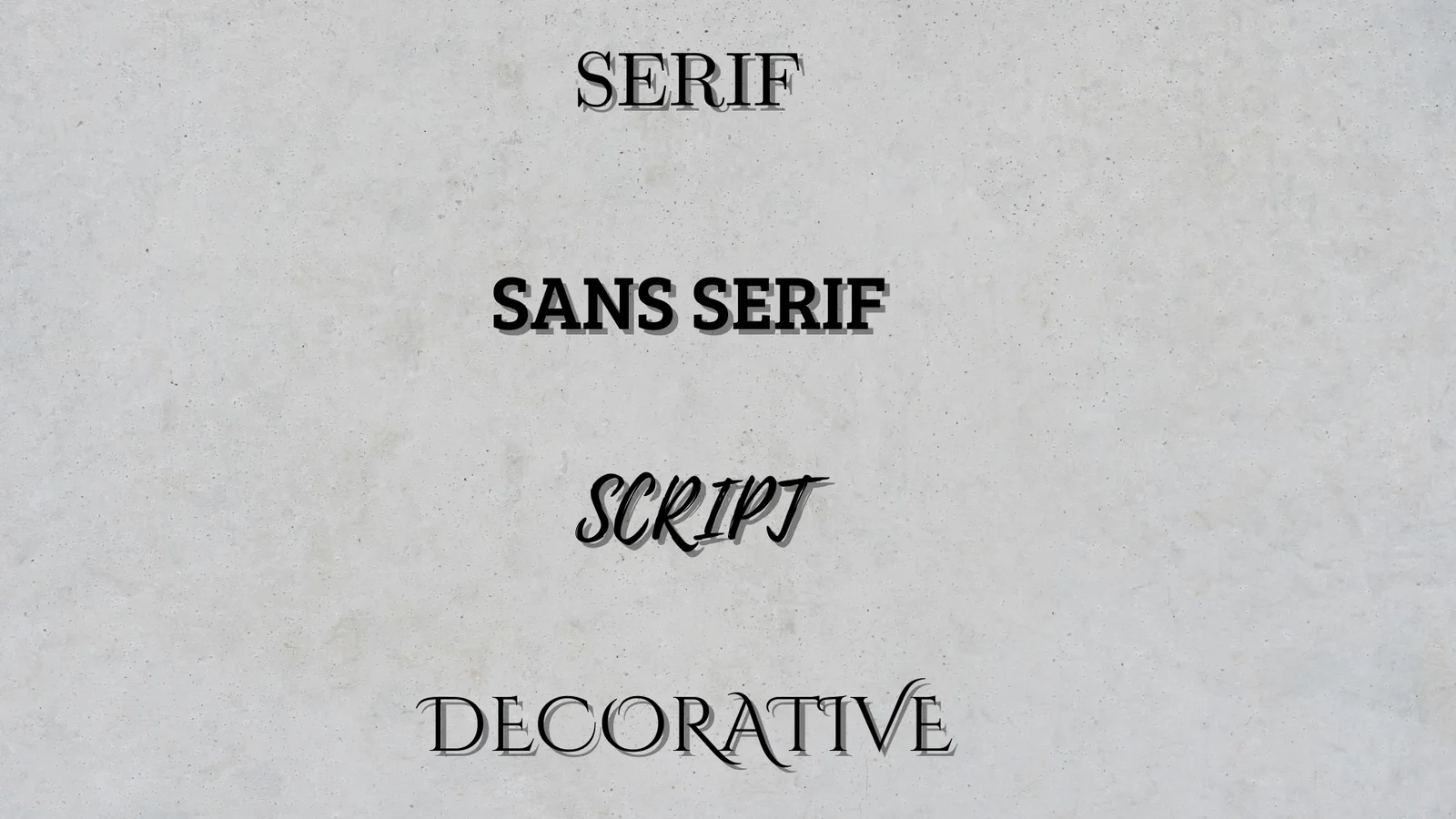
2.1 Serif
Serif fonts feature small strokes or lines (serifs) at the end of characters.
- Examples: Times New Roman, Georgia
- Tone: Traditional, authoritative, professional
- Usage: Suitable for formal or academic emails, especially with longer content
While they work well in print, serif fonts may appear less sharp on low-resolution screens.
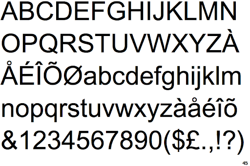
2.2 Sans Serif
Sans serif fonts are clean, simple, and lack the extra strokes found in serif fonts.
- Examples: Arial, Helvetica, Verdana
- Tone: Modern, minimal, clear
- Usage: Ideal for email bodies and digital interfaces; highly legible on all screens
This is the most widely recommended category for email readability.
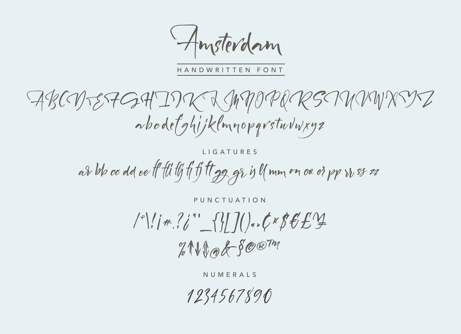
2.3 Script
Script fonts mimic handwriting or cursive writing.
- Examples: Pacifico, Lobster
- Tone: Elegant, personal, creative
- Usage: Best for signatures, logos, or design elements—not body text
Script fonts reduce legibility and should be used sparingly in professional emails.
2.4 Decorative
Decorative fonts are highly stylized and creative.
- Examples: Zapfino, Copperplate Gothic
- Tone: Playful, artistic
- Usage: Limited to headings or promotional material, not suitable for body content
3. 10 Best Email Fonts
Here’s a closer look at the top 10 fonts for email communication, including web-safe and web fonts:
3.1 Arial
- Category: Sans Serif
- Pros: Universally supported, clean, simple curves, web-safe
- Usage: Default in Gmail and many clients; safe choice for any email type
- Note: May not stand out, but ensures clear and consistent delivery
3.2 Verdana
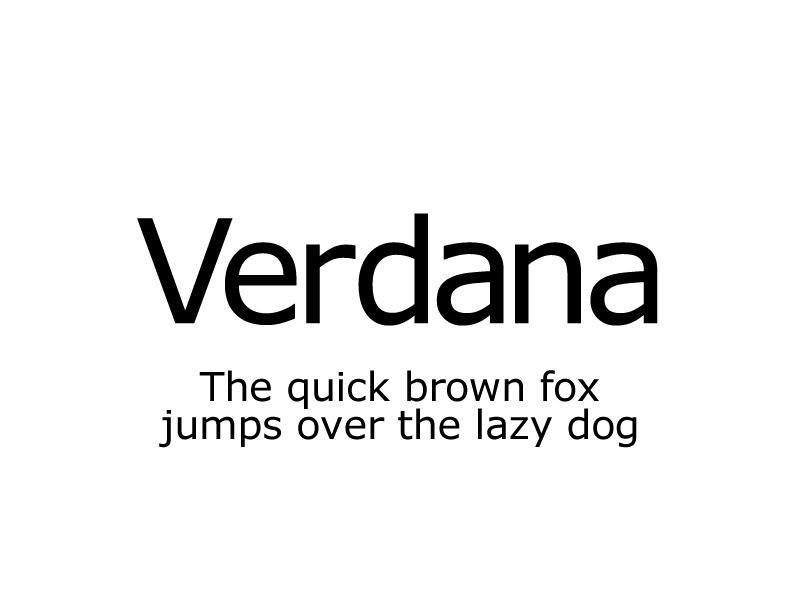
- Category: Sans Serif
- Pros: Designed for screen use, wide spacing, highly readable
- Cons: May feel bulky and consume more space
- Special Tip: Not ideal for German text due to quotation mark issues
3.3 Georgia
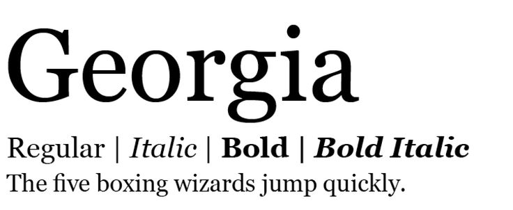
- Category: Serif
- Pros: Professional, spaced for screen readability
- Usage: Formal emails, editorial content
- Note: Might feel dated, but effective in specific use cases
3.4 Helvetica
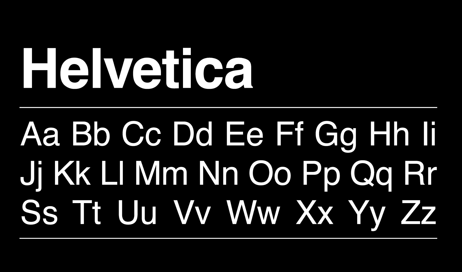
- Category: Sans Serif
- Pros: Clean, widely used, modern feel
- Cons: Tight letter spacing can reduce readability in long text blocks
- Note: Default for iCloud Mail; best for headers and short copy
3.5 Tahoma
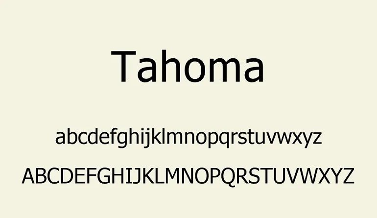
- Category: Sans Serif
- Pros: Narrower than Verdana, great for compact spaces
- Usage: Content-rich emails, design-heavy layouts
- Note: Slightly more formal; works well in conservative industries
3.6 Times New Roman
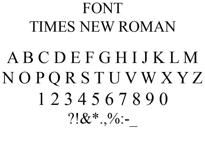
- Category: Serif
- Pros: Highly recognized, space-efficient
- Cons: Narrow letters slow reading; considered outdated
- Usage: Occasionally for formal or academic audiences
3.7 Open Sans
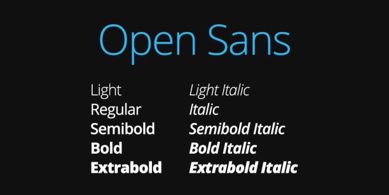
- Category: Sans Serif (Web Font)
- Pros: Friendly, minimal, designed for digital use
- Cons: Not web-safe; fallback needed
- Usage: Marketing and modern interfaces; ensure font rendering fallback is set
3.8 Roboto
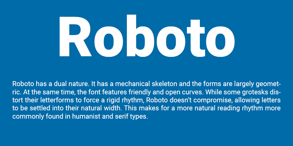
- Category: Sans Serif (Web Font)
- Pros: Created for screens, geometric and clean
- Cons: May appear “robotic,” some rendering issues in Outlook
- Usage: Used widely in modern SaaS platforms
3.9 Raleway
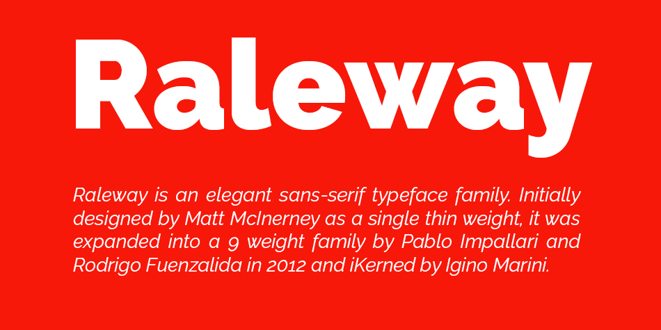
- Category: Sans Serif (Web Font)
- Pros: Elegant, thin font, excellent spacing
- Cons: Not universally supported; thin strokes may hinder readability
- Usage: Great for stylish campaigns or lifestyle brands
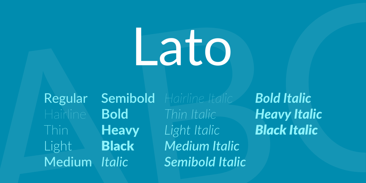
3.10 Lato
- Category: Sans Serif (Web Font)
- Pros: Friendly and round; great for body text
- Cons: May appear bold in Gmail
- Usage: Versatile for professional and casual use; ensure fallbacks
4. Choose the Best Fonts for Email
Align with Purpose
- Formal: Choose serif fonts like Georgia for authority
- Modern and Clean: Sans serif fonts like Arial, Open Sans, or Roboto
- Friendly: Use Lato or Verdana for a casual, approachable tone
- Creative: Use Raleway or Script fonts sparingly in headings
Align with Brand Identity
Ensure consistency between your website, logo, and email fonts. If using a custom brand font, select a web-safe fallback that visually complements it.
Match the Reader’s Needs
- Mobile-friendly: Use sans serif fonts sized at least 14px
- Accessibility: Prioritize readability for all users, including those with visual impairments
- B2B vs. B2C: Corporate audiences may favor more traditional fonts
5. Email Fonts Best Practices
To ensure your emails remain professional, readable, and effective, follow these essential font practices:
1. Use Web-Safe Fonts When Possible
- Web-safe fonts are universally supported (e.g., Arial, Georgia, Tahoma).
- Web fonts (like Roboto, Open Sans) look great but may require fallbacks.
Always define a fallback chain:
font-family: ‘Roboto’, Arial, sans-serif;
2. Choose the Right Size
- Body text: 14px–16px
- Headings: 18px–22px
- Signatures/Footnotes: 12px minimum
3. Use Adequate Line Spacing
- Recommended: 1.5x to 2x the font size
- Prevents crowded text and improves scannability
4. Limit the Number of Fonts
- Stick to 1–2 fonts per email for consistency
- Use one for headings and one for body copy if needed
5. Avoid Overly Decorative Fonts
- Avoid using script or decorative fonts for large blocks of text
- These fonts reduce professionalism and hinder readability
6. Test Across Devices
Always preview your email on desktop, tablet, and mobile before sending. Font rendering varies by device and email client.
Conclusion
The best font for email is one that balances readability, professionalism, and brand alignment. Fonts like Arial, Georgia, and Verdana continue to be safe and trusted choices, while modern web fonts like Open Sans, Roboto, and Lato offer enhanced style if used properly.
By understanding font categories, selecting appropriate typography for your message and audience, and following best practices, you can increase engagement and leave a lasting impression with every email you send.
